
Eiju Matcha
2026 Graphis New Talent Gold Award Winner
A multi-sensory café concept translating the Japanese tea ceremony into a contemporary urban experience of calm.

About the Brand
Inspired by the principles of wa, kei, sei, jaku — harmony, respect, purity, and tranquility — Eiju Matcha invites city dwellers to slow down. The design combines muted natural tones, tactile materials, and biophilic elements to evoke a meditative atmosphere. Every brand touchpoint carries the rhythm of stillness, transforming a drink into a daily ritual of renewal.
Role
Brand Designer
Graphic Designer
Student Work


Moments of pause framed through color, material, and motion.


Japanese rice bag–inspired packaging for Eiju Matcha’s tea blends — a fusion of craft, materiality, and ritual.
Tea packaging featuring the Sado typeface, uniting Eiju Matcha’s visual identity through form, texture, and calming typography.


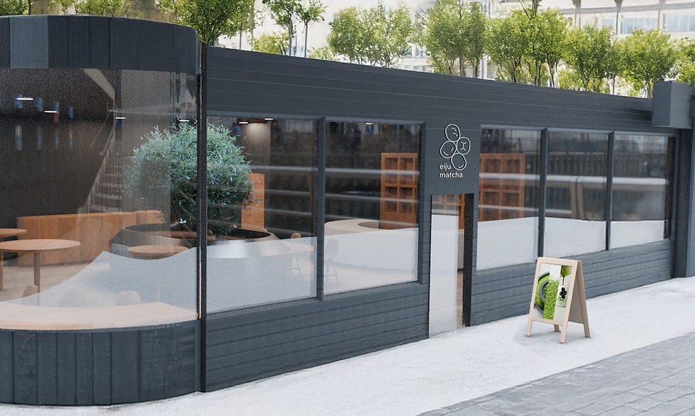

About the Space
Inspired by the healing power of nature, the dark, minimalist space utilizes biophilic design and muted tones to foster a concise sanctuary of calm amidst the city.
The dark exterior is a subtle invitation. Inside, find a sanctuary of deep relaxation where the pace of the city fades away. Front counter concept of Eiju Matcha where preparation and packaging come together to slow the pace and invite mindful connection.

Process + More
A glimpse into our full range of collateral: process book, prints, custom paper cups, coasters, and behind-the-scenes photoshoot moments.


